LA City Council website
Bringing the Los Angeles city government closer to the people
Case subject
Elysian Valley Council. Los Angeles.
www.myevrnc.com
Tools & Platform
Figma, Squarespace, Maze.co
Audience
/ Primarily — The public in the Elysian Valley area: People who want to act on topics and look for information on the council.
/ Secondly — The council board members.
Scope
/ A complete homepage plus subpages with dummy content.
/ Migration of all data and media of the current website.
Role
UX Design. Web Development. Content plan.
Constraints
/ The website must be built on Squarespace.com.
/ Expected to complete within six months.
/ Must have Spanish translation feature.
/ Due to low budget, only the homepage is required to have real content.
Teammate
Betty Feinblatt (Scheduler, Workshop coordinator)
Context
Elysian Valley Council is one of many councils in the city of Los Angeles that advises the City government on policies affecting their residents. The Council’s website had become outdated and failed to serve its purpose as a bridge between community residents and council members. Our mission was to reinvigorate the site to foster community engagement while making council resources and updates more accessible.
In addition to creating a new website, our deliverables included visual and data backups of the decade-long data residing on the WordPress platform, presenting new platform options, and implementing migration and transfer. I had one teammate who coordinated workshops and testing schedules, while I took on all other work and designs. The result was a vibrant, community-spirited website that elevated the council’s online presence and highly engaged the residents.
Problem
Elysian Valley Council’s website acts as a conduit between the public and its board members, currently it’s not serving the purpose. People don’t feel the website appealed to them. How might we improve it so that the council is more successful in sparking interactions?
Solution
A comprehensive redesign focused on enhancing user engagement and interaction. The new website will be designed to appeal to residents by incorporating community-oriented look and feel, engaging event promotions, and inclusive meeting invitations.
The new website will provide valuable information while also supporting board members in publishing events, organizing information, and interacting with the public. This approach aims to foster greater community engagement and participation.
To clear what the client expects, where they are, and help them understand their options
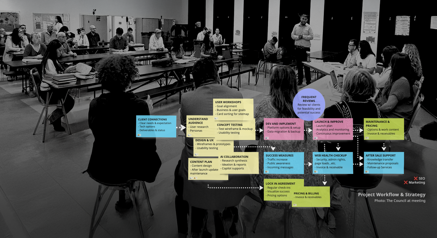
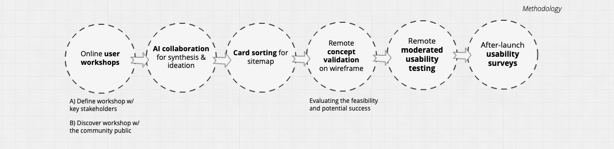
Methodology
We began with online user workshops, engaging stakeholders and the community to uncover key insights and align on project goals. These sessions helped shape the website’s direction and set the stage for a user-centered design. We then used AI tools for synthesis and ideation to process these insights and generate initial concepts, followed by a card-sorting exercise to refine the sitemap.
After creating wireframes, we conducted concept testing to validate the design’s feasibility. We wrapped up with remote moderated usability testing on both desktop and mobile devices, followed by after-launch usability surveys to gather feedback and make post-launch improvements. This process ensured the website met both user needs and business goals.
📝 Methods used:
- Online user workshops
– Define workshop w/ committee members
– Discover workshop w/ the community public - AI collaboration for synthesis & ideation
- Card Sorting for sitemap
- Concept Testing on wireframe
(Evaluating the feasibility and potential success) - Remote moderated usability testing
- After-launch usability surveys
Listening to understand the stakeholders. Frame the problem and come to a solution
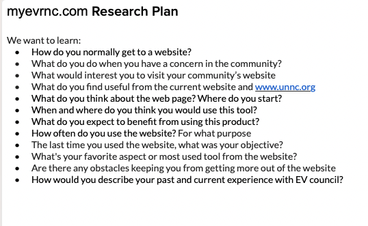
To align on goals, define the target audience, and set the direction for the project, we kicked off the project by conducting workshops, diving deep into their needs and expectations. These workshops were held in two different sessions: one with the council members and another with the public residents.
Goals of the workshops:
- Clarify Project Goals: Understand the client’s vision, objectives, and success metrics.
- Define Target Audience: Identify and define the primary and secondary users.
- Scope Definition: Outline the project scope, deliverables, and timelines.
- Stakeholder Alignment: Ensure all stakeholders are on the same page regarding direction and expectations.
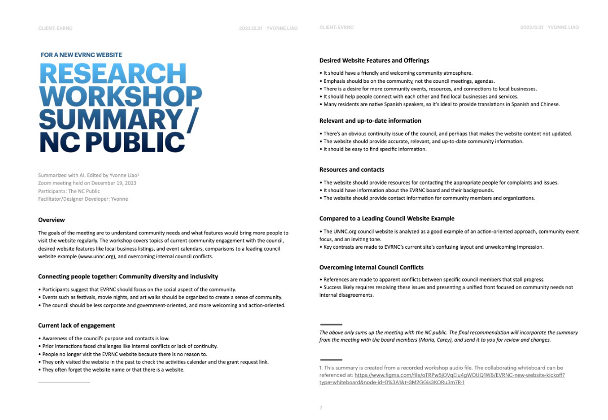
Both sessions were revealing and enlightening; community members shared frustrations about inaccessible meeting information and the lack of Spanish translations.
My lighthearted icebreaker warmed the room (“what do you do when stepping onto a dog poop?”). Although most of the time participants preferred talking over typing on the digital boards, we left with a roadmap aligned with their vision and constraints.
Objectives aligned
Using insights from these discussions, we defined clear objectives: an intuitive sitemap, inclusive language options, and interactive elements to boost engagement.
High level goal
Create a website that engages users, is visually appealing and user friendly.
Business goals
- Increase community engagement by 30% in the next year.
- Provide transparent information about council activities
- improve communication between residents and the council.
User goals
- Easily find information about council meetings, events, and resources
- Participate in community discussions
- Able to contact the right council members who are responsible for the subject
Communicate to clarify the requirements
Our research uncovered three key user needs: effortless access to meeting and event information, clear communication channels, and a welcoming design. Armed with these insights, we drafted a project plan that included a mobile-responsive homepage, a streamlined archive for past agendas, and a Spanish language toggle. The council’s tight budget added a layer of challenge, but we embraced it as an opportunity for focused, creative solutions.
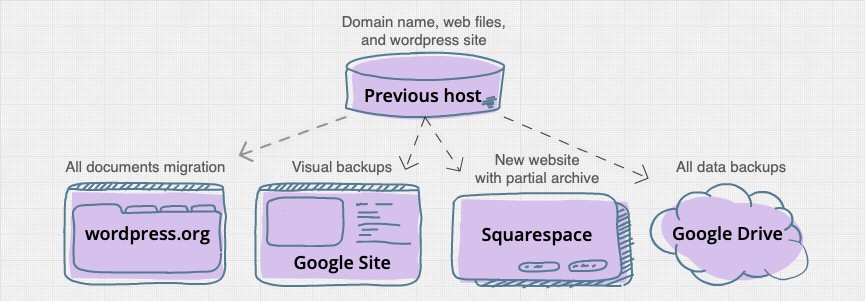
Deliverables
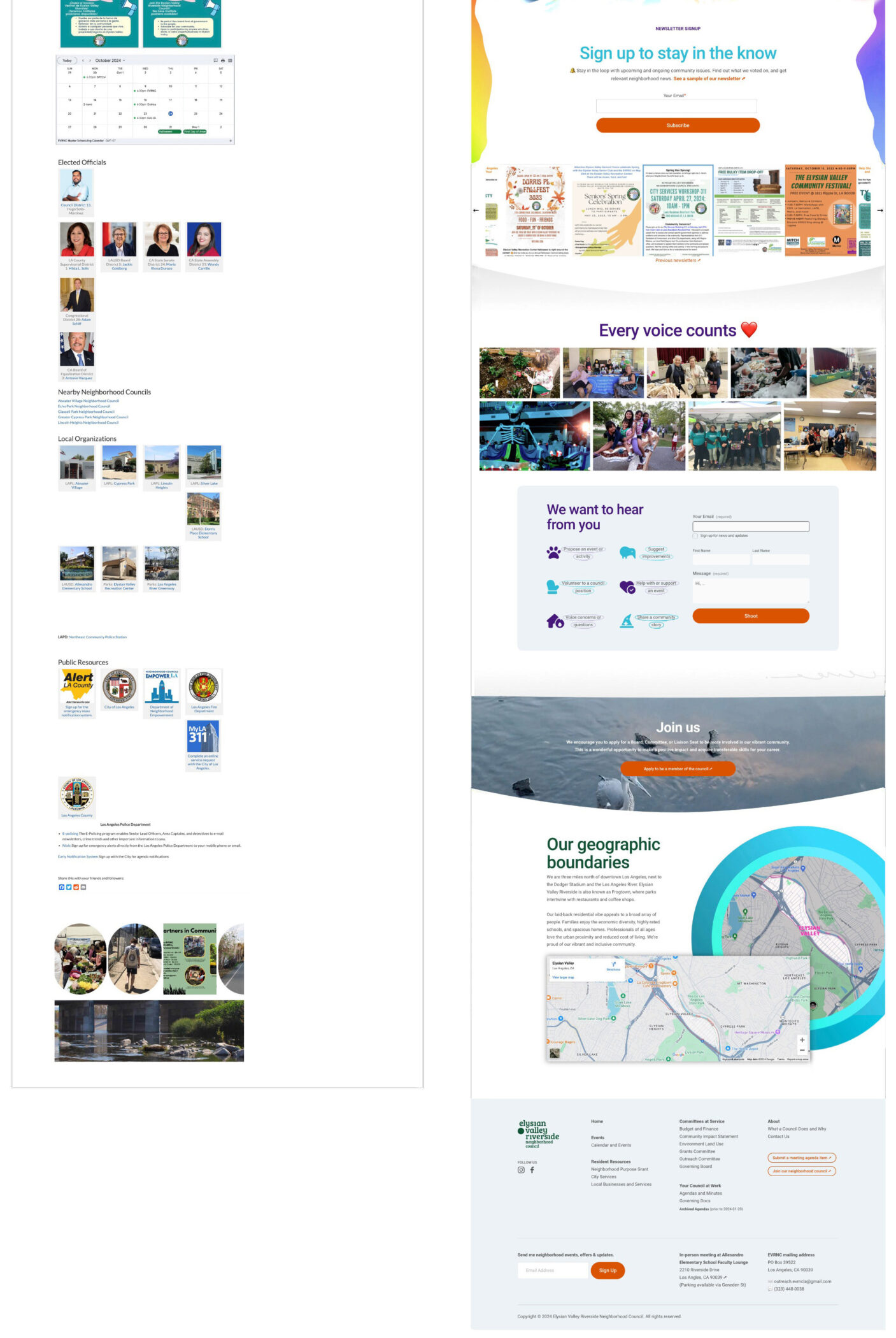
- A complete designed and developed homepage on squarespace.com.
- A form of public-accessible backup of previous/archived Agendas and Minutes (2015-2024).
- Non-public website of the old site as a visual backup.
- Transfer domain name from the current host to Squarespace.
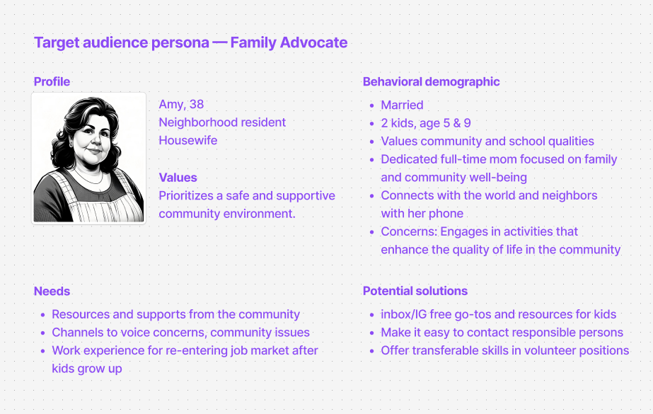
Forming a persona
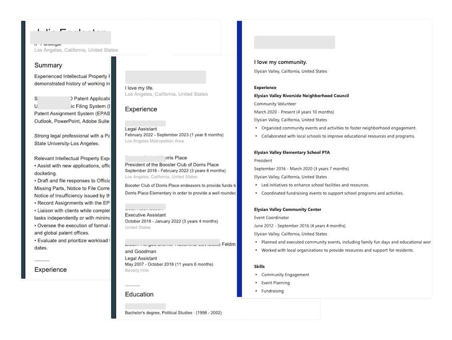
From our interviews, we crafted a persona: Amy, a bilingual resident juggling work, family, and a desire to stay involved in her community. Amy needed a website that respected her time with clear navigation, mobile compatibility, and content in Spanish. Amy became our North Star, ensuring every design decision served her needs.
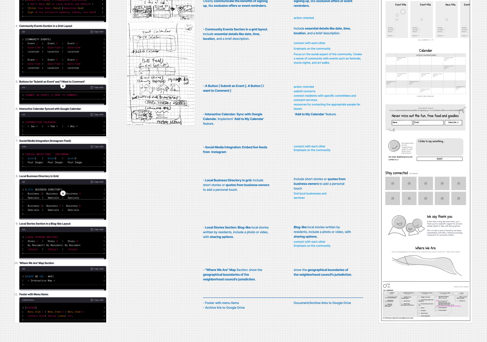
Ideate design solutions
We explored design trends and competitive examples, drawing inspiration from nearby community websites like Los Feliz and United Neighborhoods. We emphasized vibrant imagery and interactive calendars while ensuring our approach was grounded in simplicity. Mobile-friendly layouts and quick-access menus became pivotal features in our mockups.
Benchmarking: Analyze websites of other neighborhood councils and community organizations to identify best practices. (Competitive Analysis)
Market Trends: Incorporate trends like mobile-friendly design, social media integration, and interactive features. (Competitive Analysis)

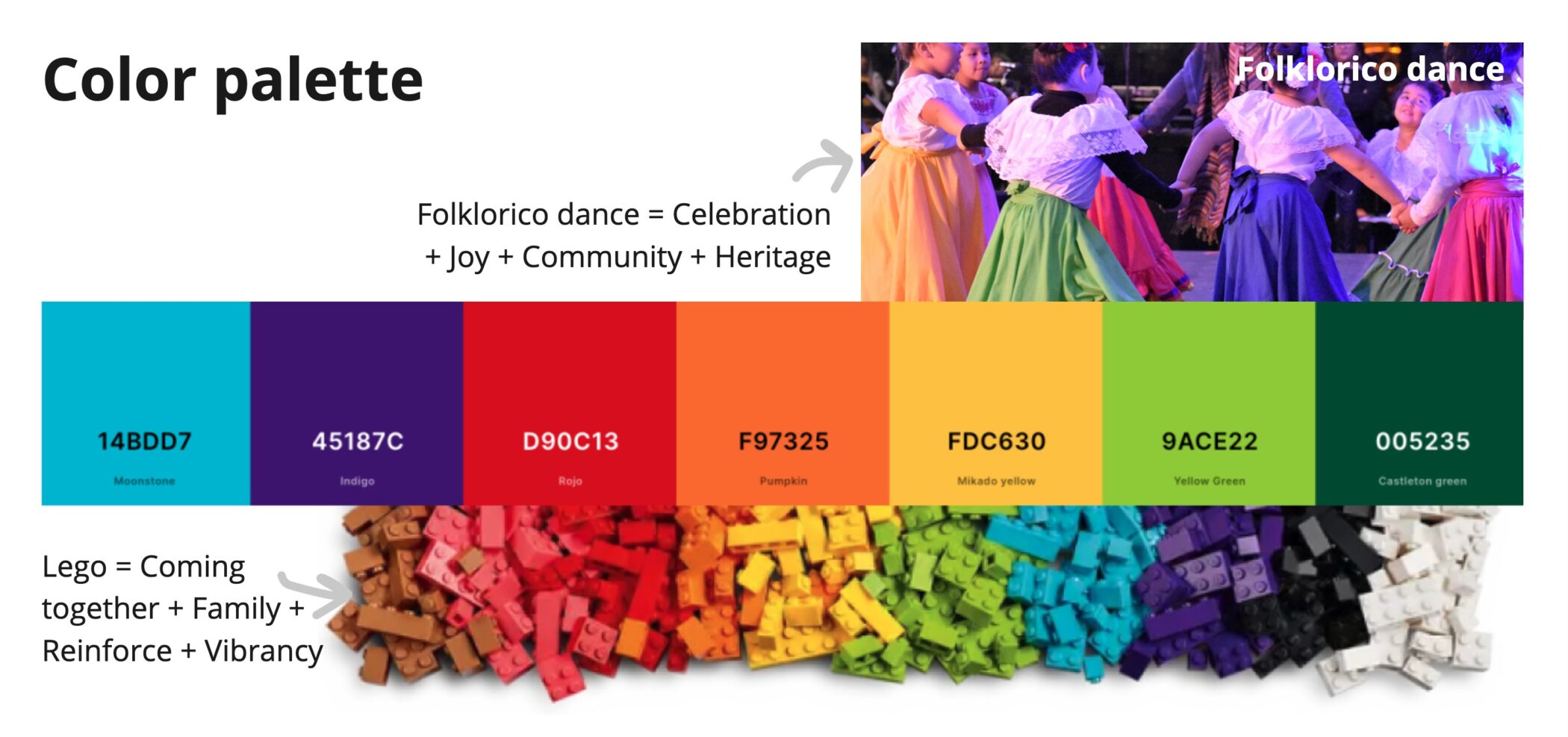
image bottom …
Finding a common ground to build rapport
One of the board members frequently stalled the project progress. I was curious to know the reason behind her reluctance to attend online meetings and allow me to make progress. After several conversations trying to understand her, I realized she shies away from technology.
After that, I welcomed feedback via emails rather than online commenting tools, and we held meetings in person instead of using Zoom. I also used everyday analogies to explain domain names and data transfers. While she didn’t facilitate the progress, she no longer blocked it either. 👍👍👍
Another lady responsible for updating the website had been frustrated with the Council’s WordPress site, which had been down a few times while she was working on it. I walked her through alternative platforms, allowing her to choose the one she felt most comfortable with. During this process, we shared our similar heart-wrenching immigration journeys. This experience built a strong relationship and trust between us. Since then, she has backed me up every step of the way.
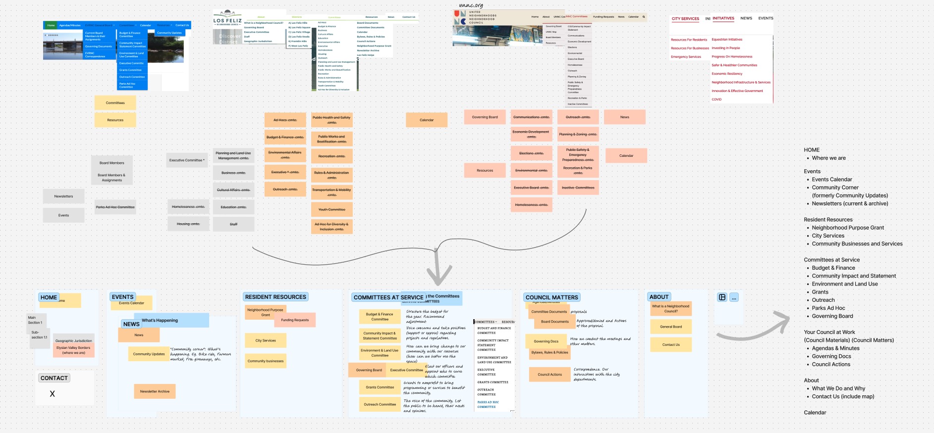
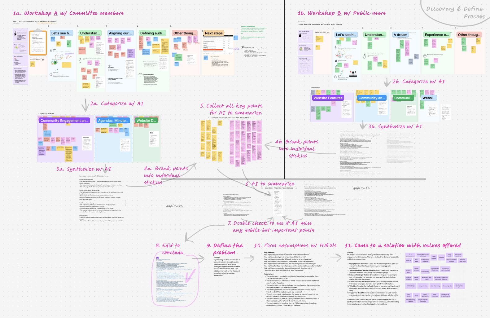
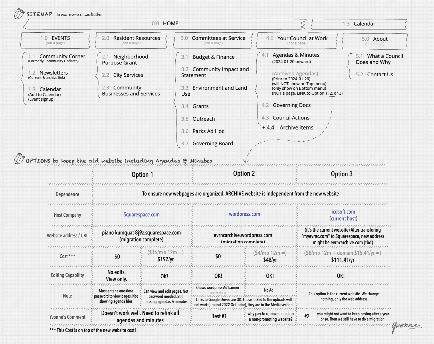
Sitemap card-sorting
During a lively card-sorting session with stakeholders, we reorganized the website’s structure to prioritize user needs. By referencing peer sites, we created a sitemap that placed key elements—like meeting minutes and event calendars—front and center. It was gratifying to watch board members excitedly debate the best ways to serve their community.
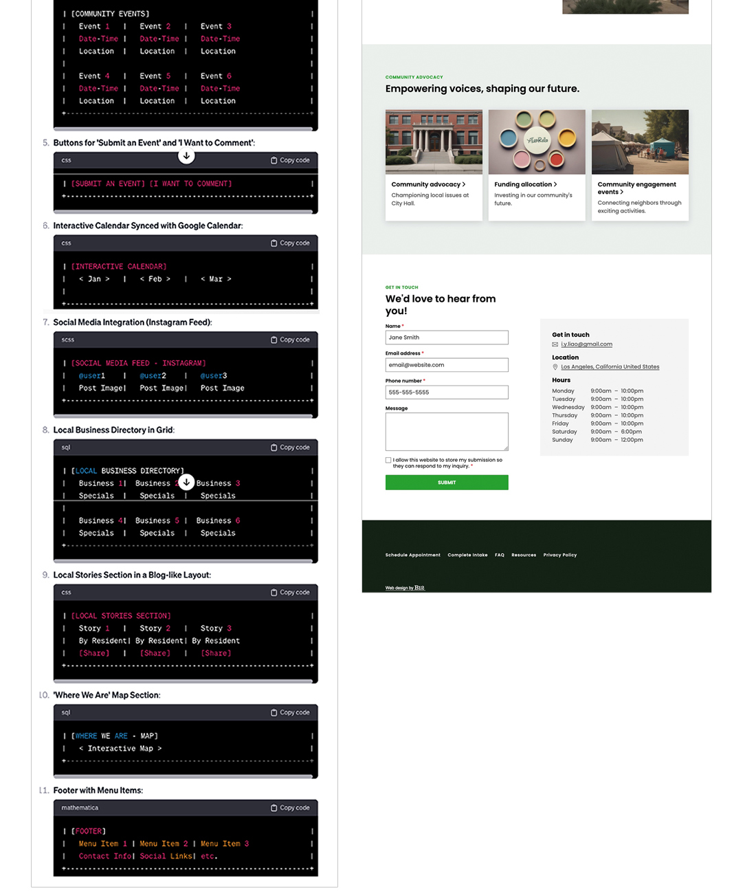
Collaborate w/ AI
We leveraged AI tools like ChatGPT and B12.co for ideation, using their suggestions to refine our designs and fill gaps in content strategy. AI proved invaluable, especially for creating wireframes and prototypes that mirrored our community-first ethos. This collaboration helped streamline repetitive tasks, giving us more time to focus on creative problem-solving.
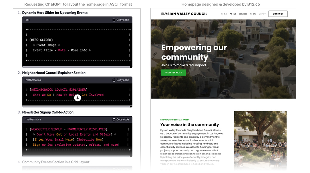
image bottom …
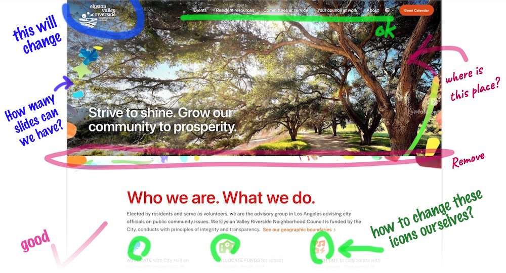
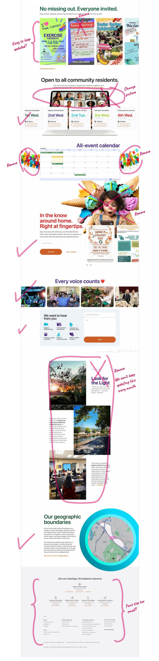
Review & validate concept
Once our initial concepts were ready, we gathered feedback from stakeholders and community members. Using their insights, we iterated on the homepage design to address key suggestions, such as making the navigation bar more prominent and ensuring event details were easy to find. Residents emphasized the importance of highlighting Spanish translation options, so we made it a central feature in our design. This collaborative review process refined our vision, ensuring the website truly met the community’s needs.
Design overturned by a board member
Upon reviewing the first high-fidelity mockup, some board members who were not involved in the initial stages of the process overturned the look and feel. They expressed that the design did not align with those of peer organizations and did not represent the council’s identity.
Although it felt like a significant setback, I listened to their perspectives and assured them that we understood their needs and would modify the design accordingly. I also communicated that the community-oriented vibe would remain, preserving the essence derived from user workshops. The redesign humbled me, as it turned out to be better than the one I initially proposed.
bottom section …
Wireframe & mockup
Our wireframes balanced functionality with aesthetics, and testing revealed just how critical these designs were to users like Amy. For instance, a simplified events section with clickable Google Calendar RSVPs earned praise during usability sessions. Seeing Amy’s persona come to life through our designs was a delightful validation of our hard work.
Content Planning: Develop content such as meeting agendas and minutes, event announcements, community news, and resources. (Content Strategy).

Develop › Implement › Launch
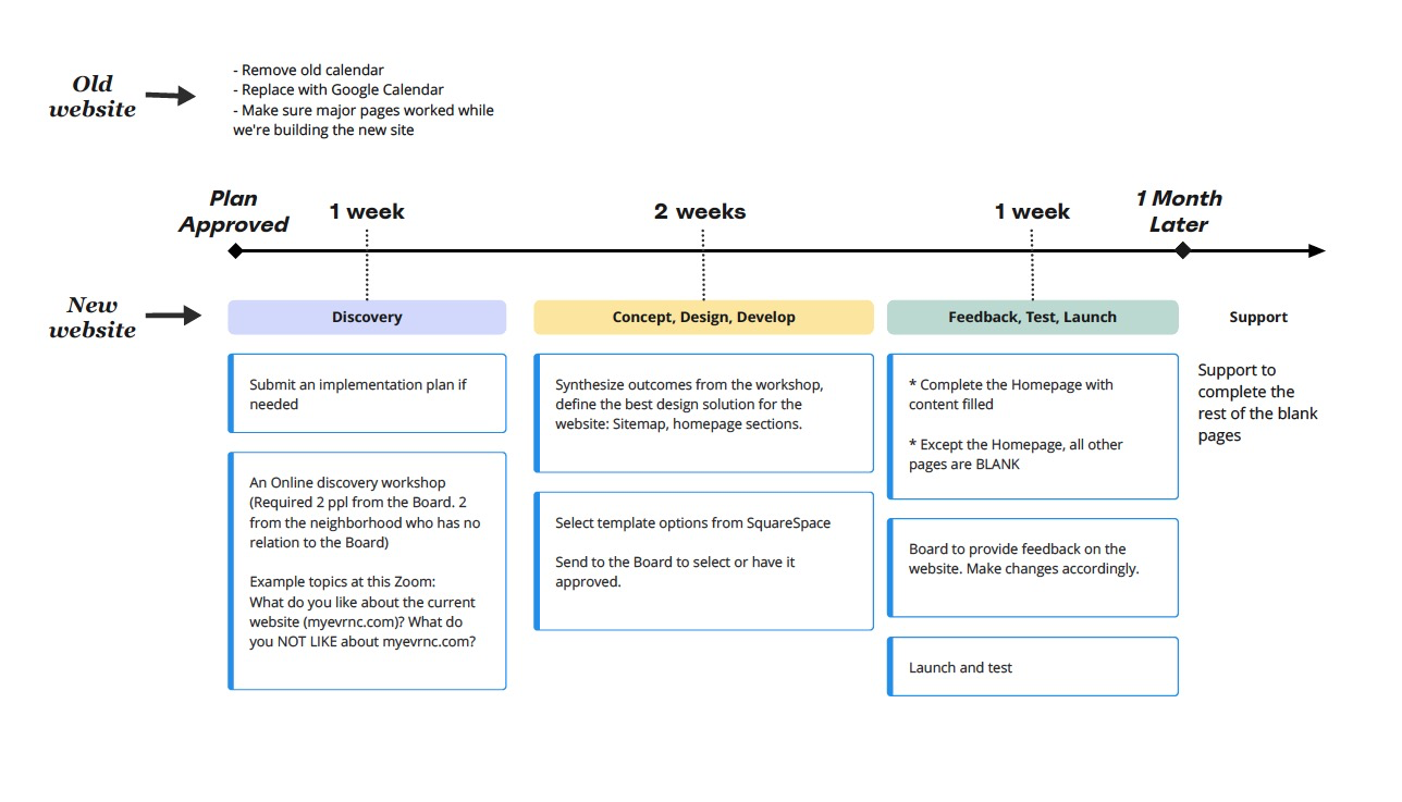
Building the website on Squarespace came with its quirks, but we carefully crafted a blank template to meet the council’s needs. We launched the site in phases, first beta-testing with a small group of residents. Feedback was overwhelmingly positive; people appreciated the intuitive navigation and vibrant visuals. On launch day, the council’s social media buzzed with excitement, showcasing their pride in this refreshed digital presence.
Launch Plan: Plan a phased launch with initial beta testing by a small group of residents. (Launch and Optimization)
Analytics and Monitoring: Set up Google Analytics to track user behavior and engagement. (Launch and Optimization)

Data migration › Backup › Archive
Migrating years of agendas and minutes required meticulous planning. We implemented an accessible archive for public use while preserving a backup of the original website for internal reference. This ensured a seamless transition without losing valuable historical data.
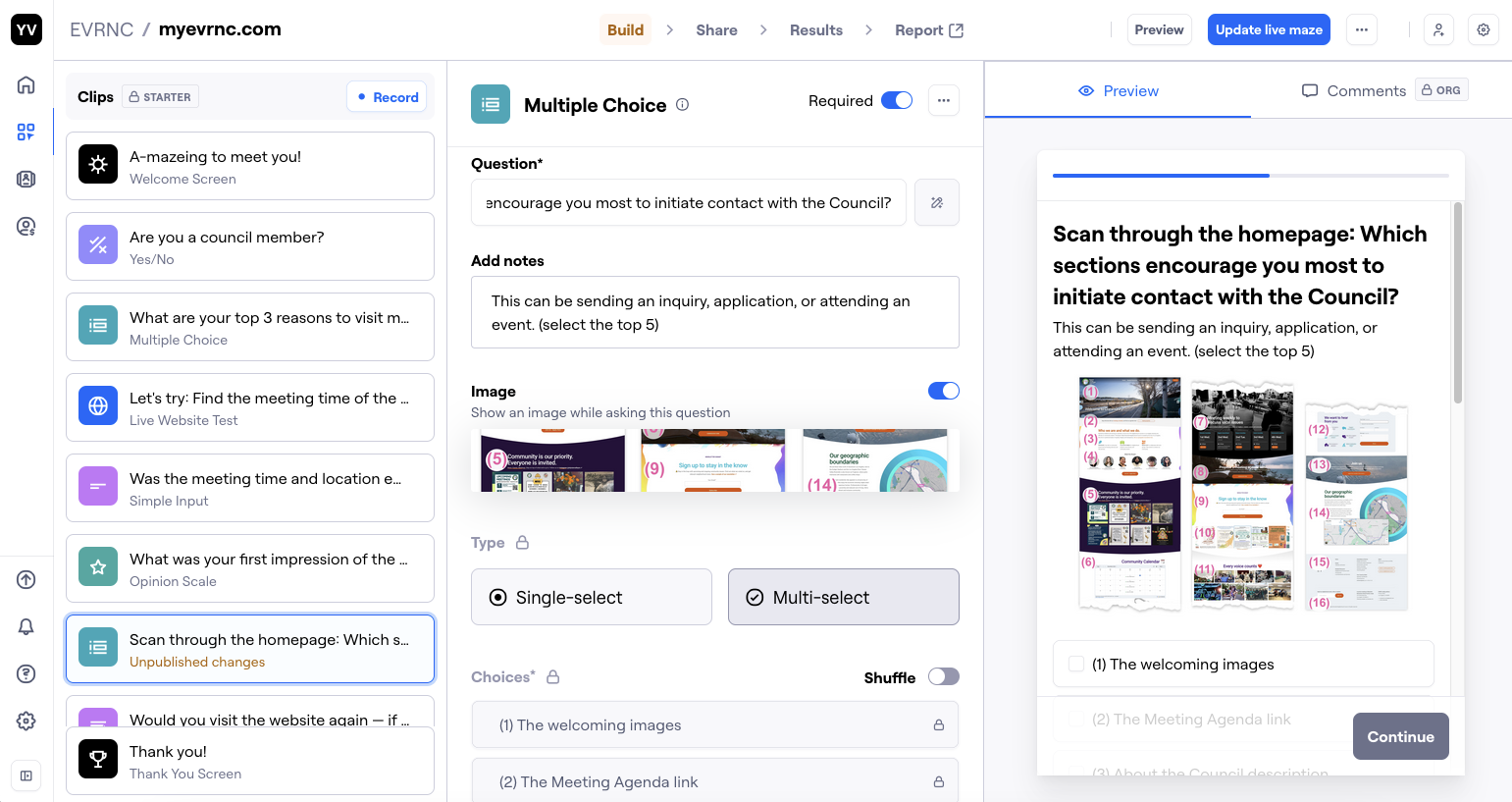
Testing. Usability
We conducted remote usability tests with a diverse group of residents. On desktops, participants praised the clean layout, while mobile users highlighted the ease of navigation. Watching a resident effortlessly locate a meeting agenda and RSVP to an event confirmed that we had achieved our goals.
Desktop test (remote moderated)
During the desktop usability test, participants were tasked with finding upcoming event details and accessing past meeting minutes. Most users navigated the homepage effortlessly, appreciating the clear menu structure and quick links to high-priority sections. However, a few pointed out that the meeting agendas could be more prominent, leading us to reinforce its position and visibility. Watching participants confidently explore the site was a rewarding moment, as it validated the intuitiveness of our design.
Mobile test (remote moderated)
The mobile test focused on ensuring the site’s responsiveness and functionality on smaller screens. Participants noted that the mobile-friendly design made scrolling and accessing key features like event RSVPs seamless. A resident mentioned how much they valued the collapsible menu, which saved space while keeping navigation easy. Testing highlighted a minor issue with spacing and button alignment on certain devices, which we quickly adjusted to ensure a polished mobile experience.
Next step
The council plans to expand the site further, incorporating features like live-streamed meetings and a bulletin board. With a solid foundation in place, we look forward to supporting the council as they continue to build community connections.
Reflection
This project was a journey of discovery, creativity, and collaboration. One of the key takeaways was the importance of deeply engaging with the community to understand their unique needs and expectations. The workshops and user testing sessions not only informed our design decisions but also highlighted the emotional connection residents felt toward their council and its mission. Seeing the positive feedback during the launch was a reminder of how impactful user-centered design can be in fostering trust and connection.
Another significant learning was adapting to constraints as opportunities for innovation. Working within the limitations of Squarespace and a tight budget forced us to prioritize the most meaningful features, focusing on functionality and usability. It also underscored the value of iteration—whether refining our sitemap, design mockups, or usability issues, each step brought us closer to a site that truly resonated. The experience was a testament to the power of collaborative design especially with AI, leaving us excited to tackle future challenges with similar passion and purpose.

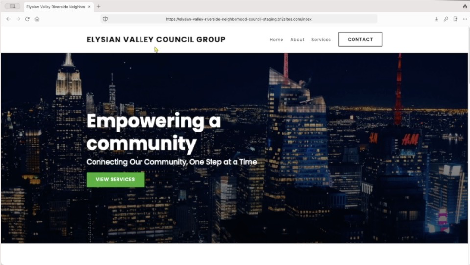
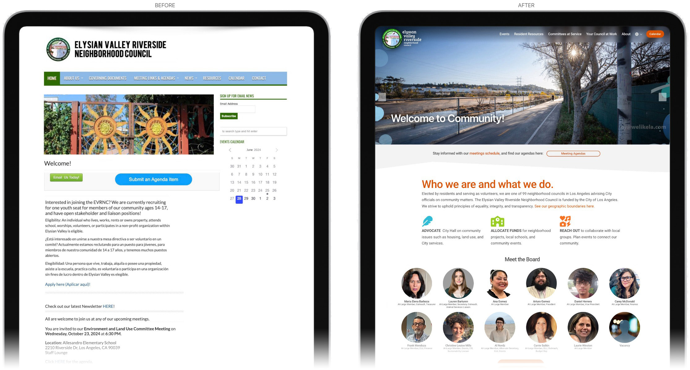
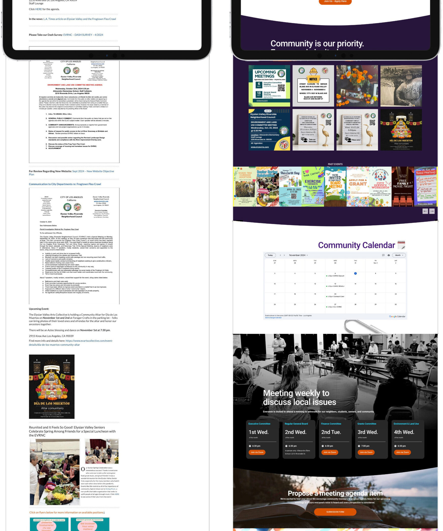
Before vs. After
The transformation is striking. Where the old site felt dated and inaccessible, the new design is bright, inviting, and intuitive. Residents now have a platform that empowers them to engage, participate, and take pride in their community.
See it launched at www.myevrnc.com.
mid section…
bottom section…