AR Gallery
Generating excitement to an unknown museum
Case subject
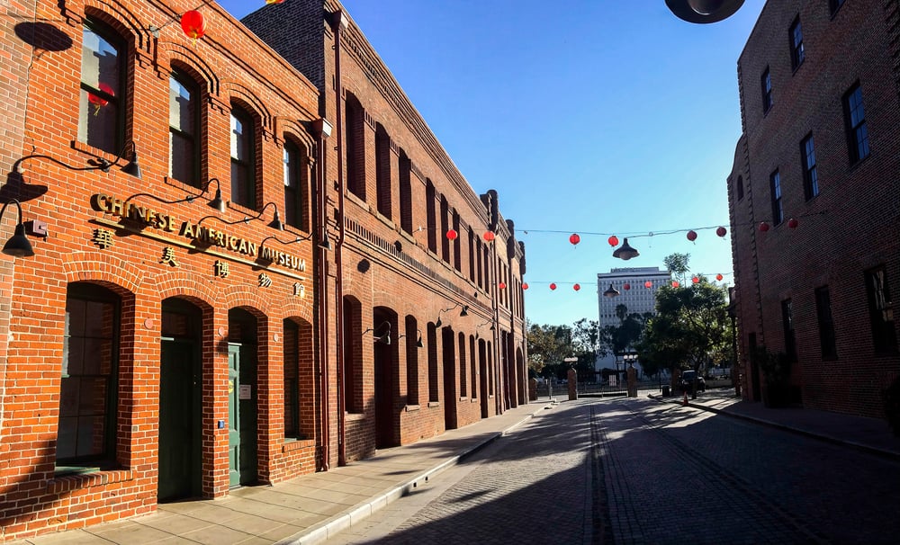
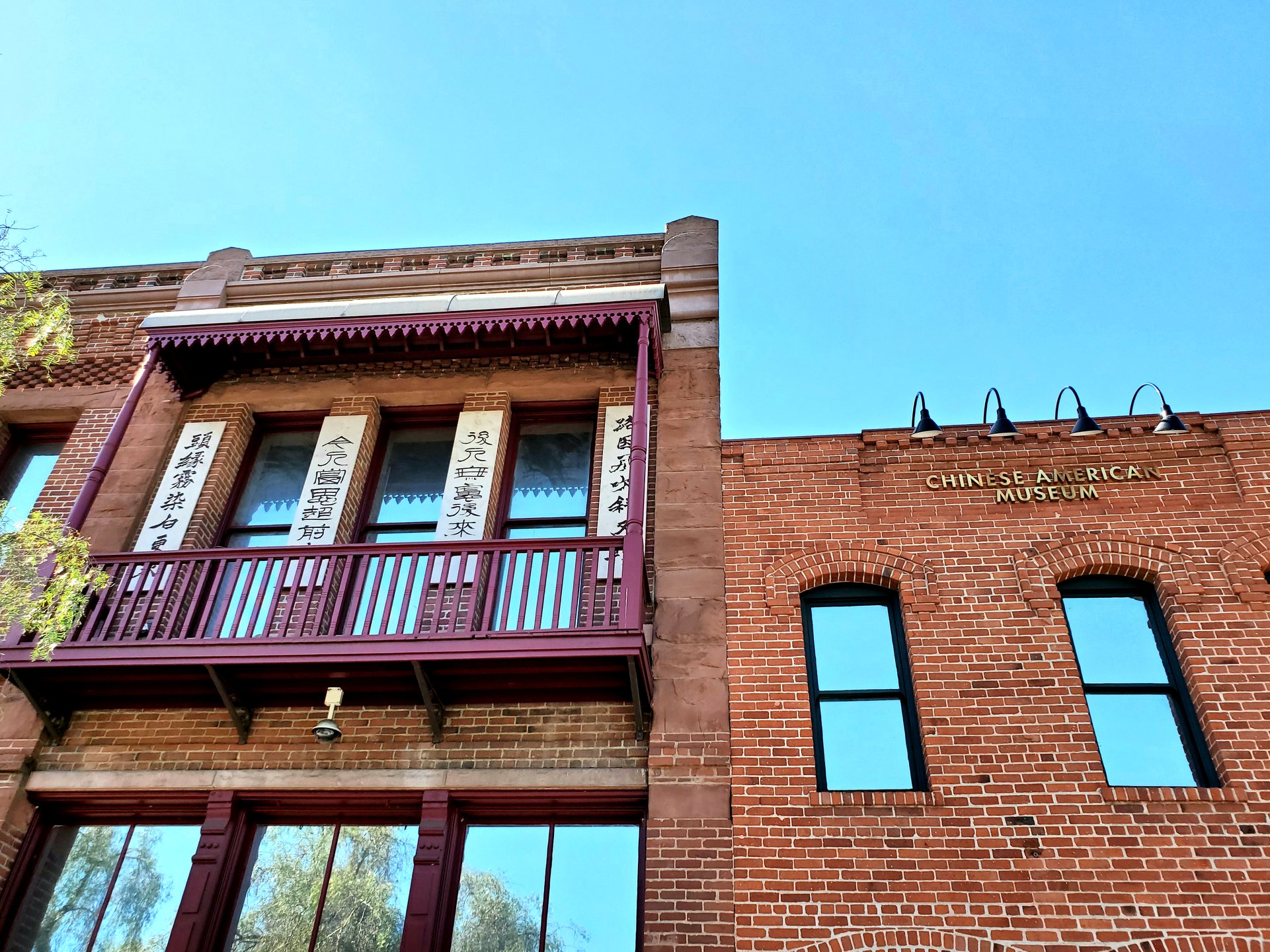
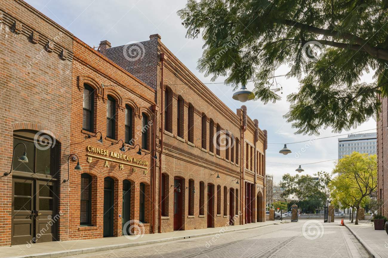
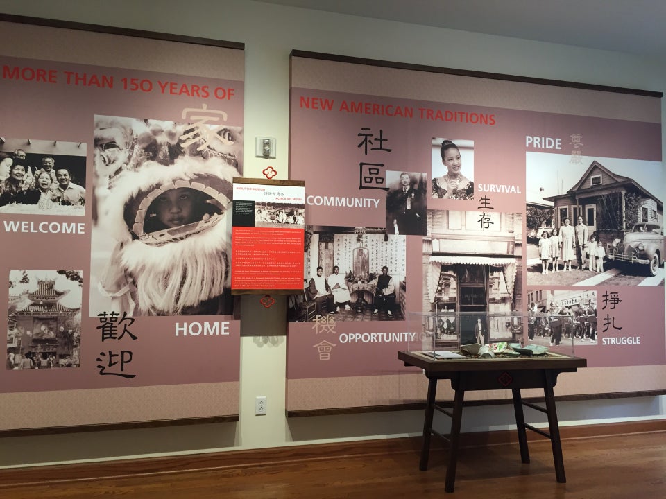
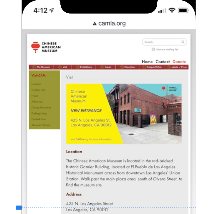
Chinese American Museum (CAM). Downtown L.A.
Tools
Principle, Sketch, Miro, Photoshop
Audience
Culturally drawn public, tourists, remote visitors
Role
UX Design
Teammates
Eunice Kim, Wei Yu
Constraints
/ Must be a mobile app
/ Must have a tour guide
/ One week to present an early concept
* This is an experimental project and has not been proceeded
Overview
Before the pandemic, I was working on a design for a tour mobile app for the Chinese American Museum (CAM). When the museum closed during the lockdown, we revised our goal to serve the remote users by crafting an at-home virtual gallery.
Through team brainstorming, experience analogy, idea grouping, and synthesis, we developed the idea AR Gallery. My focus is to uncover the sensory or emotional factors that intrigue and sustain user interest. Then use that finding to stage an immersive experience.


The key takeaway is that we are almost certain AR will be the future of museum-visit companions. And it must be enjoyable as well as educational.
The Problem
(Reframed for remote visitors)
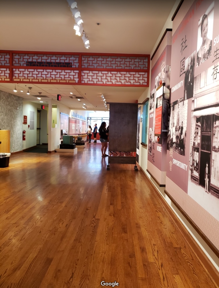
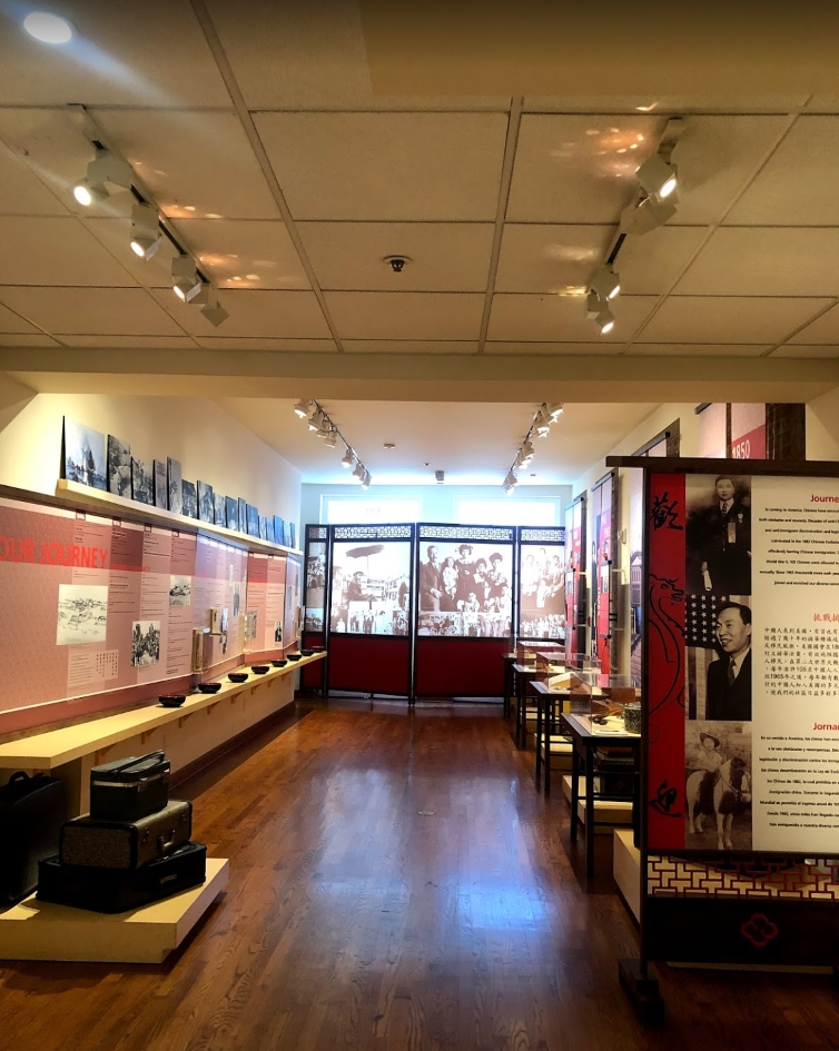
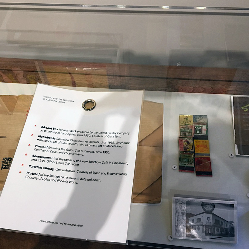
As a rare surviving monument, CAM represents a cultural treasure with a rich history but provides very few online resources for the public. When the museum is closed, this lacking of remote access to exhibits is even more palpable—the interested audiences have no means to see or learn about the museum. CAM needs to connect better with online visitors to tell the stories of immigrants who helped build a great America.
The Solution
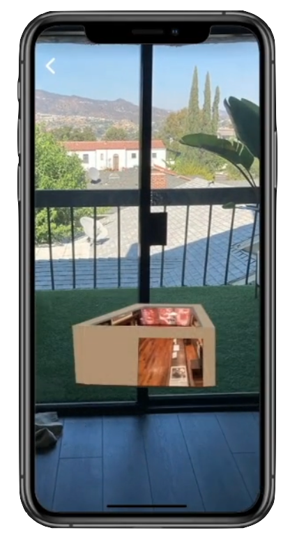
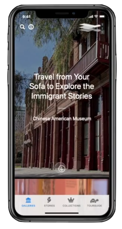
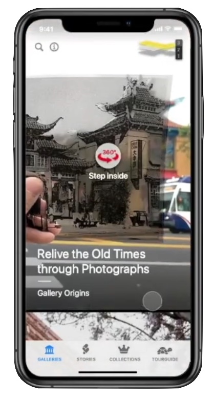
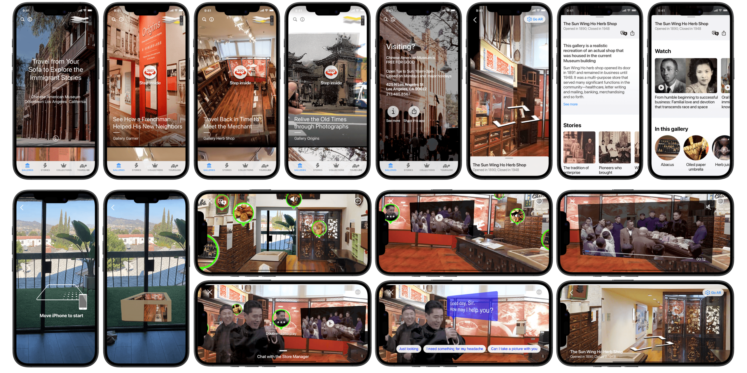
Through analysis of prominent augmented reality apps, we present the mobile app AR Gallery. It is a gateway leading users into the five galleries of the museum, telling stories in the settings of AR including videos and audio. Users can sit on a couch to see a gallery pop up in their homes, step inside to browse, learn about artifacts through audios, videos, or a dialogue with a virtual character. The project outcome is a prototype for further development, which gives remote visitors to enjoy CAM anytime, anywhere.
My role
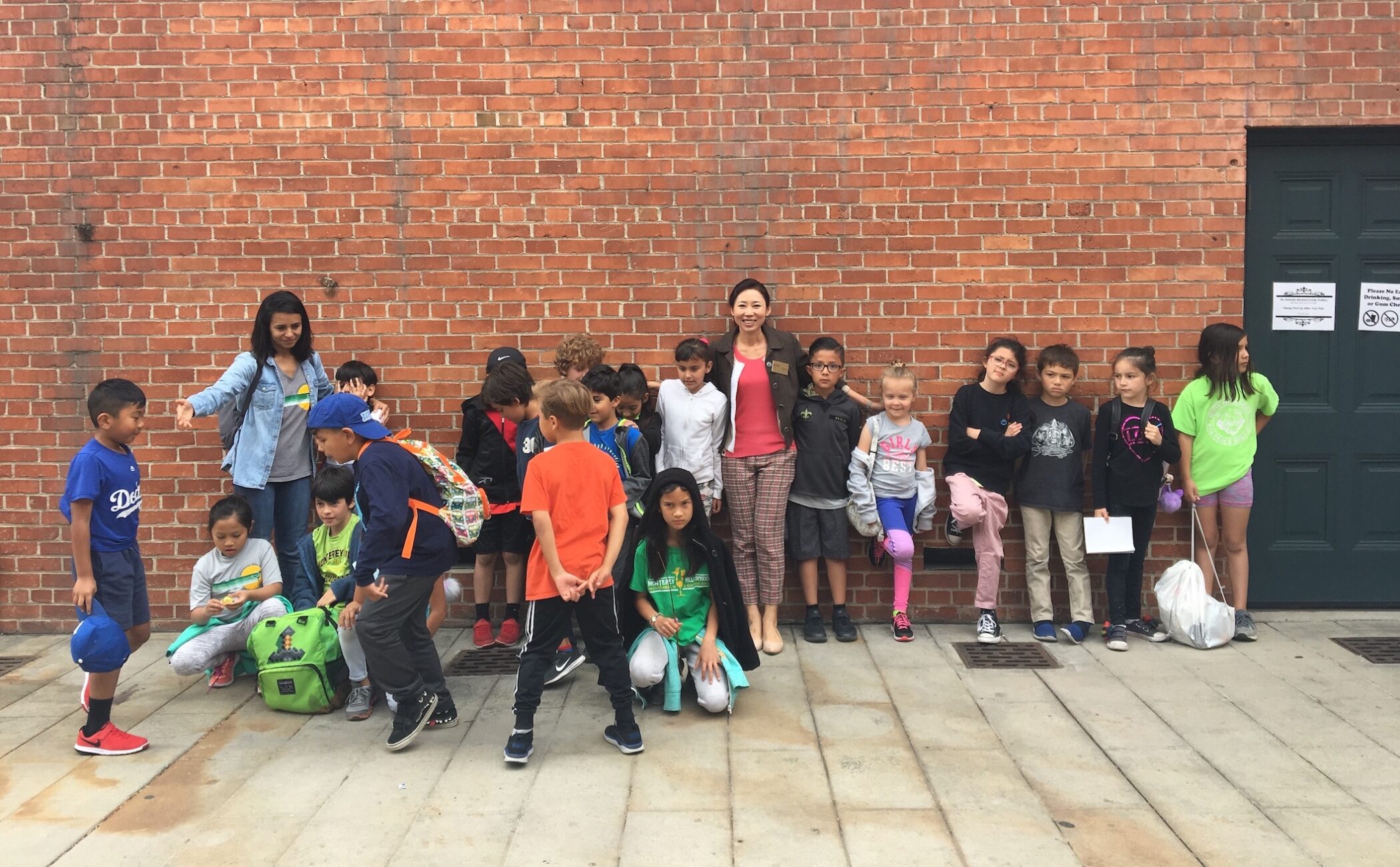
I conducted research, ideation, and created all hands-on work. With much help from CAM’s staff, I accompanied and personally led several tours to deep-understand the audiences.
Being able to empathize with users first-hand, uncover the importance of an immersive experience, then weave layers of excitement into a product or environment is what I value most.


The field study
On different days, I talked to 7 visitors, 4 with groups and the other 3 alone by themselves. My goals on these contextual inquiries were to —
- understand visitor needs as they occurred,
- their workarounds when these needs are not met, and
- which parts of the exhibitions are most appealing. I found:
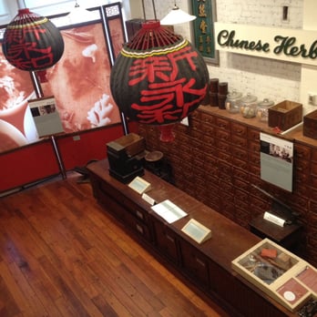
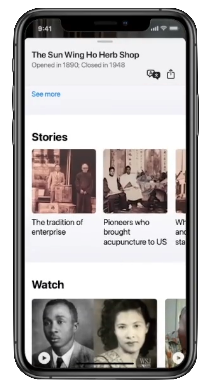
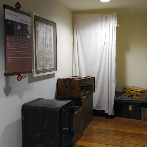
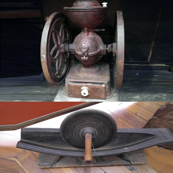
1. Visitors stay long in the Gallery Herb Shop and Albert’s bedroom, asking all sorts of questions
2. Young and old, all want to know more about the tools used in the shop; how they functioned
3. Visitors are disappointed when unable to find the translation or companion card for details
4. Some people turn to the security guard for answers, others search on the internet or the museum website

Mapping insights
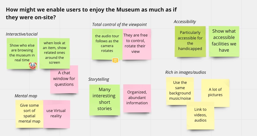
So How might we immerse people into the exhibited history and its surroundings?
From my experience of being a docent several times at this museum, talking to all kinds of visitors, and teaching children and young adults in my early years, I learned the way of getting my listeners’ attention —
On top of asking questions and finding a common ground, we must use sight, hearing, movement, and touch to give the audience more than one way to connect with what they are experiencing. So they show interest, become engaged. And with that, I developed a diagram to answer the How-might-we question:
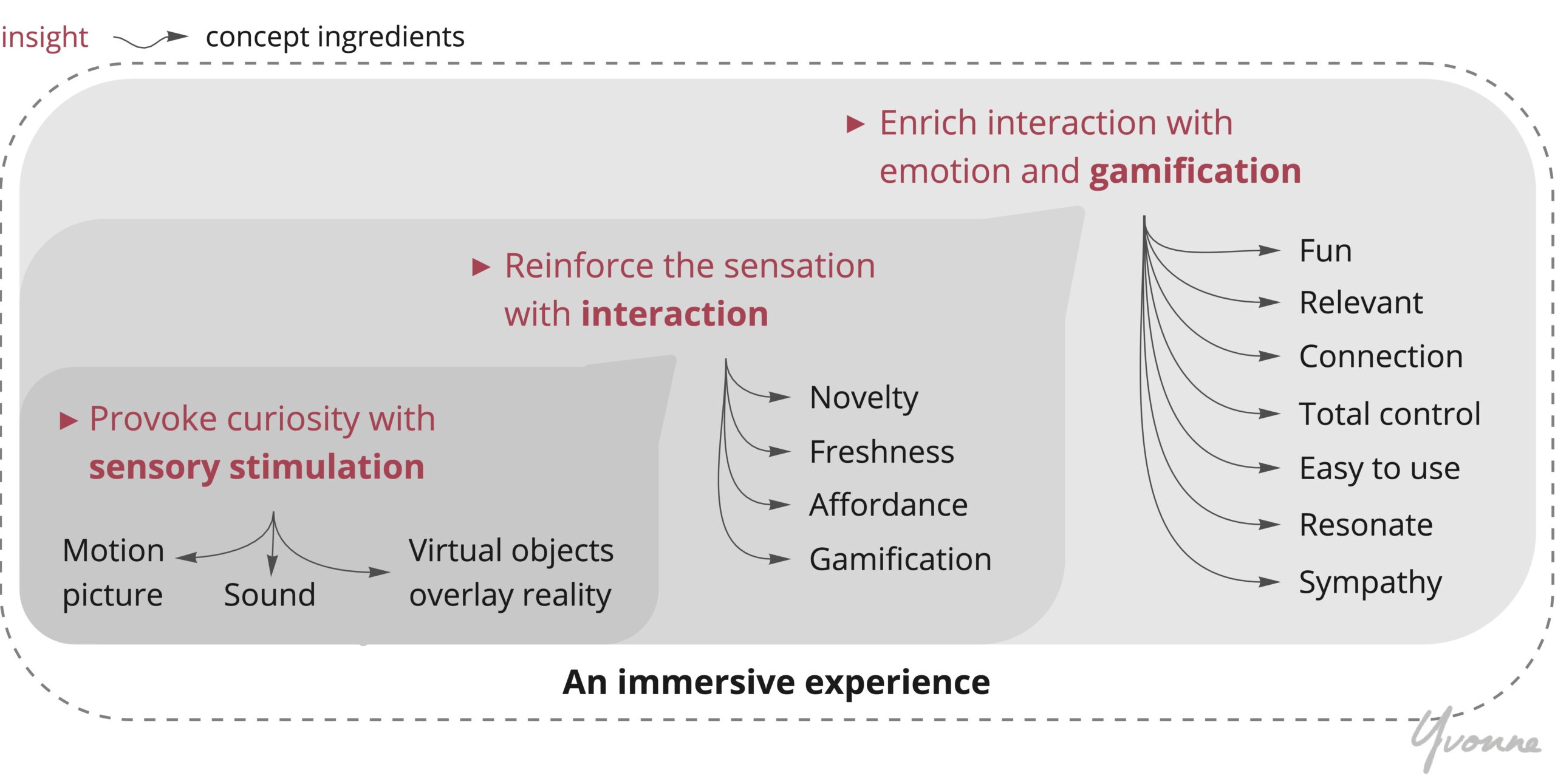
In sum, the insight is that the user’s immersion is triggered then layered at three levels. Each layer with its corresponding factors together form a cohesive immersive experience:
- the ‘sensory stimulation’ base, which extends to
- the ‘interaction’ layer, then
- enriched by ‘gamification.’
This multi-sensory journey is very much like playing a shooting video game from a first-person view. When we are the shooter, we gradually become excited as our senses are awakened by sounds, images, animations that come from different directions. And these components are the foundation to build screen flows and contents later in the process.

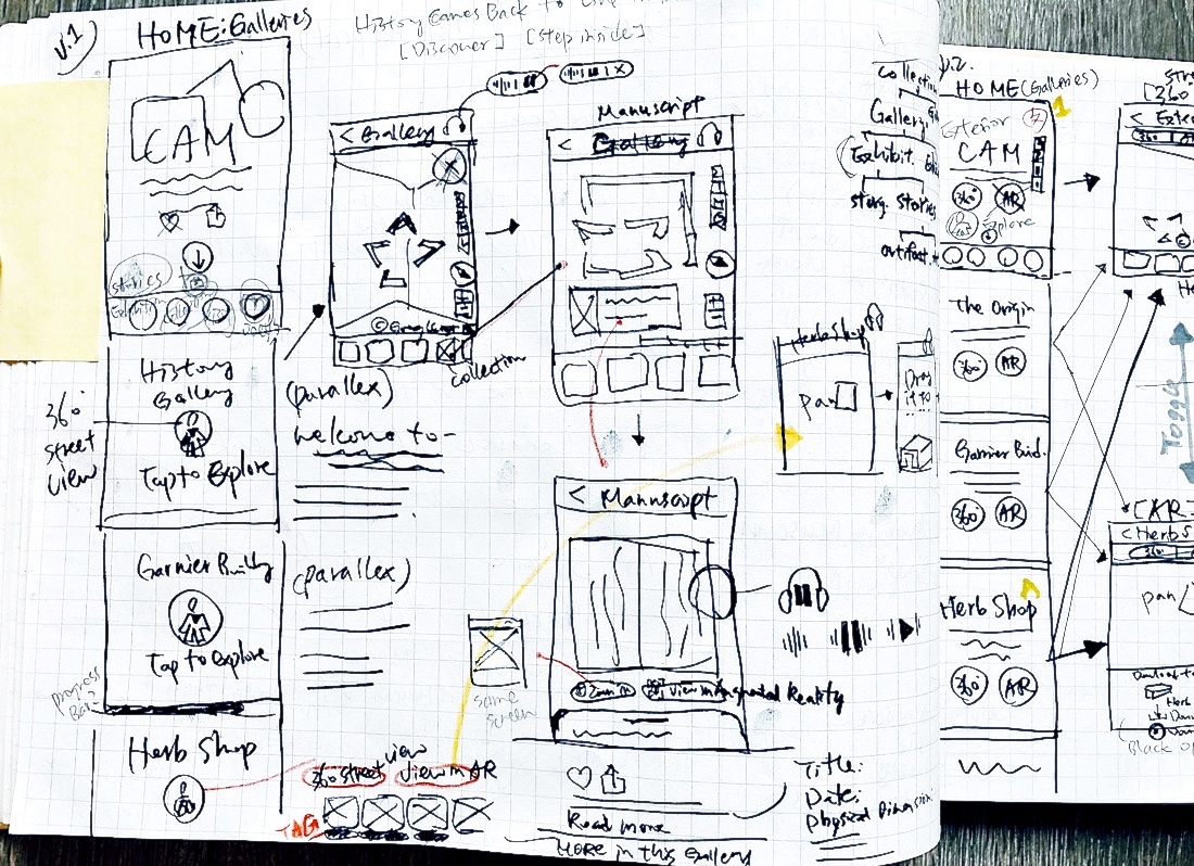
Sketching a concept
For the initial concept review, I hand-sketched screens for a walkthrough video, infusing playful ideas from research and ideation.
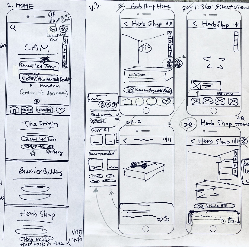
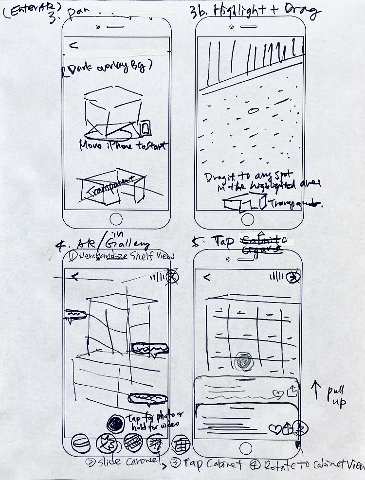
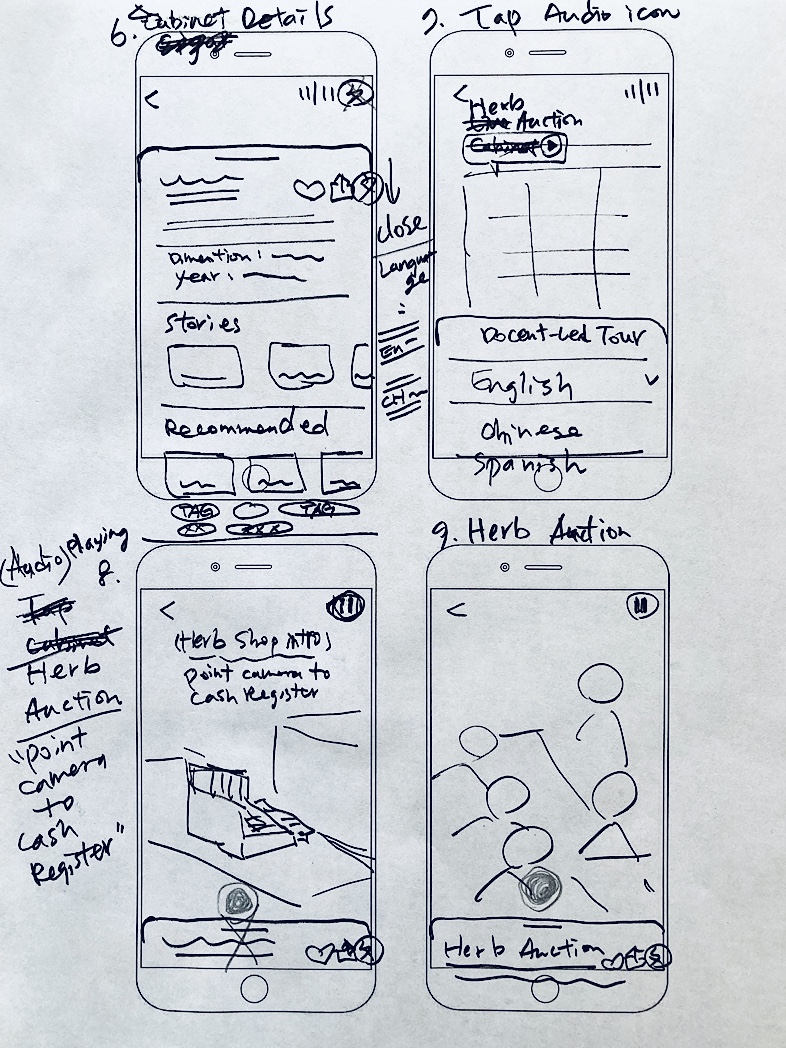
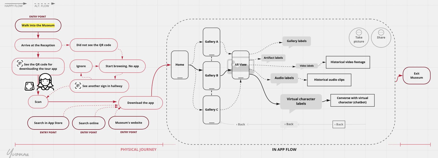
To ensure visitors can stroll freely but stick to a fixed route, all five galleries’ entrance photos are stacked on the homepage, serving multiple start points.
Contents are modularized based on physical exhibitions for easy navigation and a clear mental map. The phone camera can scan real-world space to play with AR hotspots.
The journey flow
I integrated the physical journey with the digital flow. The app screen shall auto-switch accord to which gallery a user is in. Multiple QR codes and free Wi-Fi info are displayed on hallways if a user lost internet connection or stopped using and later got back in.
This digital guide needed to be intelligent and flexible for pause and reconnect. We don’t want to assume that the visitor will stay with it from start to finish or be free of tech issues.
Visualizing a concept
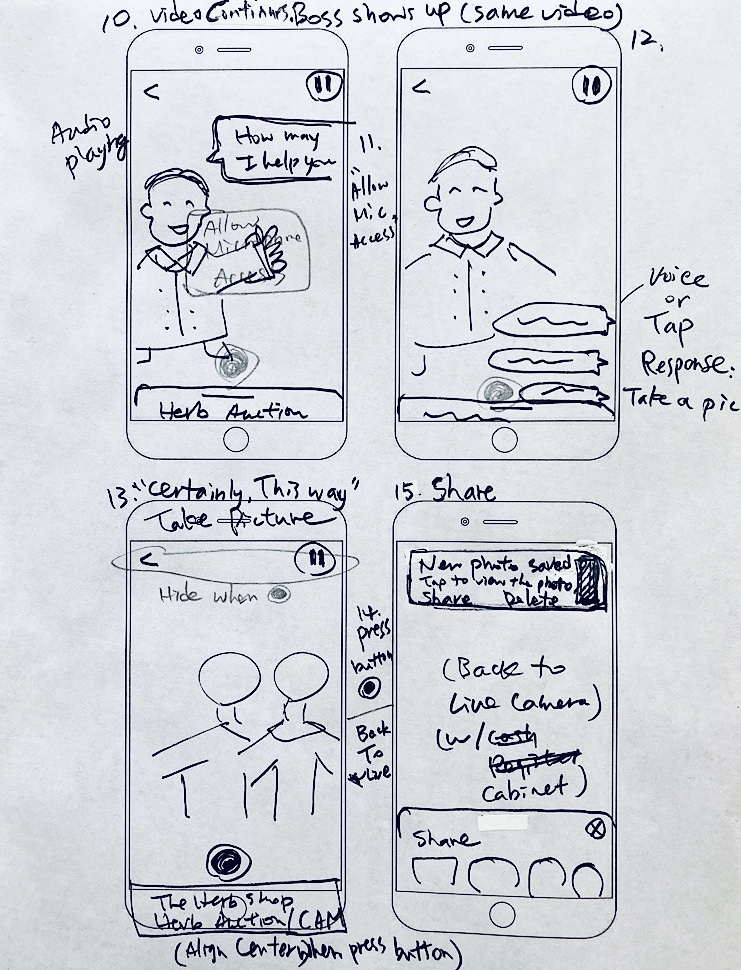
Within the project’s first week, I created a rough cut to show a vision concept that concludes from all research up to this point. This is as well to ensure we are aligned with expectations and being recognized to move forward.
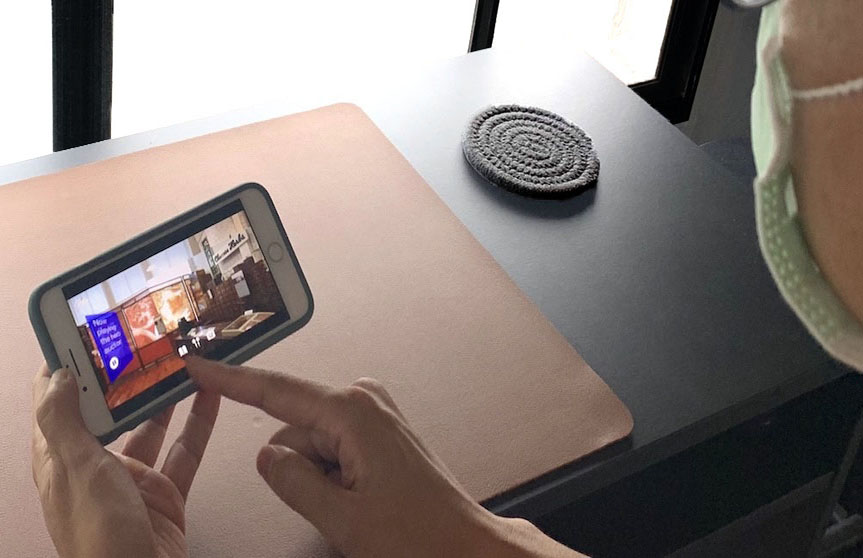
We targeted onsite visitors at that time, so the scenario was — a teenager visits in person for schoolwork, learns about the Gallery in AR, interacts with a virtual clerk. The feedback was positive, with the surprise of where I got the video footage. Here I must disclose that it’s not real, but a reenact from a TV series of what it could’ve been like.
User input on early concept
The feedback was profoundly insightful:
From a museum staff
The lady was glad to see it’s accessible to the handicapped. The museum has a hard time accommodating wheelchairs — most of the exhibits are at the eye level of stand-up people, so it’s challenging for them to look at. And the elevator not reaching every floor makes it even worse.
This design removes that obstacle, enables the disabled to enjoy it all at their fingertips.
From a museum-goer
- Don’t want to hold up the phone to look at the screen all the time; want to be hands-free and just listen to audio intermittently.
- Would like to have more interaction with the virtual environment.
- Not sure if he’d know how to get to the AR session.
These inputs were assessed and parked for design inspiration and validation.
User giving critics 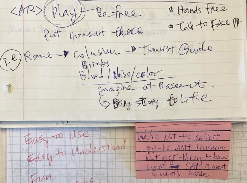
Some notes
An unexpected diversion
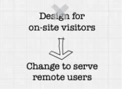
Up at this point, my work was devoted to the on-site visitors.
When learning the stay-at-home order extended and the museum would close longer, an uneasy decision was made to shift the targeted users from the on-site to the remote.
This presented new challenges besides the existing ones. Although it means axing a certain amount of work, I was excited at the new quest ahead.
Understanding remote visitors
When the museum closed for the longer term, I talked to the museum’s Event Coordinator and three other people. My goal was to know their future plan and understand how people feel about browsing in an AR space at home. I learned:
Feedback from the museum staff
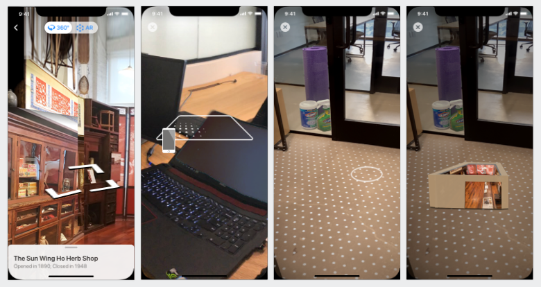
- The docent-led tour would switch to online, emphasizing the necessity of 360° street-views with artifacts marked for detail. It brings the most approximate experience of an onsite visit.
Feedback from users
- Need more guides for AR sessions: Some of them are new to augmented reality and aren’t clear how it works.
- They don’t want to stand up the whole time when browsing the gallery. Preferred sit down to zoom in and out of the virtual gallery.
Redefine the challenge
A new challenge was redefined for remote users:
During this challenging time, public spaces are closed, contact with others is discouraged. All these make people feel isolated and alone. We want to provide a new way to travel and explore the world from home comfort, hassle-free. They should feel like going out and have fun.

This brought up two questions:
- How might we enable visitors to enjoy the virtual museum as much as an in-person experience?
- How might we smooth their transition, from the usual in-person visit to the unfamiliar remote?
Ideation
We ran a quick remote brainstorm on the how-might-we questions. Sticky notes were grouped alike to categorize. Patterns were then surfaced to inspire ideas. Accompanied with a broad review of the existing museum and AR apps and learned from their merits, we developed a hypothesis that leads to a quick solution for tests.
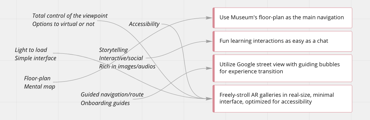
The high-level hypothesis that guides us forward:
“We believe launching a virtual museum at visitor’s homes for them to walk inside will be entertaining — they’ll feel like going out and traveling to another world. This will increase visitor’s interest in our museum and want to come to visit in person when we reopen.”
Synthesize
Starting with low-fidelity sketches, I ran an ten-minute sketch session, novel ideas emerged. The consensus was that incorporating game-play and chat-bot has the best chance of success.
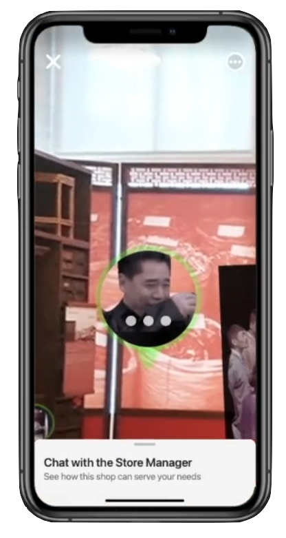
Inspired by video games, team conversation sparked the idea of showing medicine tidbits via a talk with a virtual store manager. And to bring history before people’s eyes, we can play a video of customers shopping in the store. All thoughts converged to the solution “AR Gallery” for design and test.
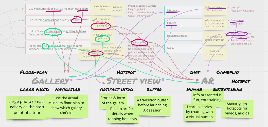
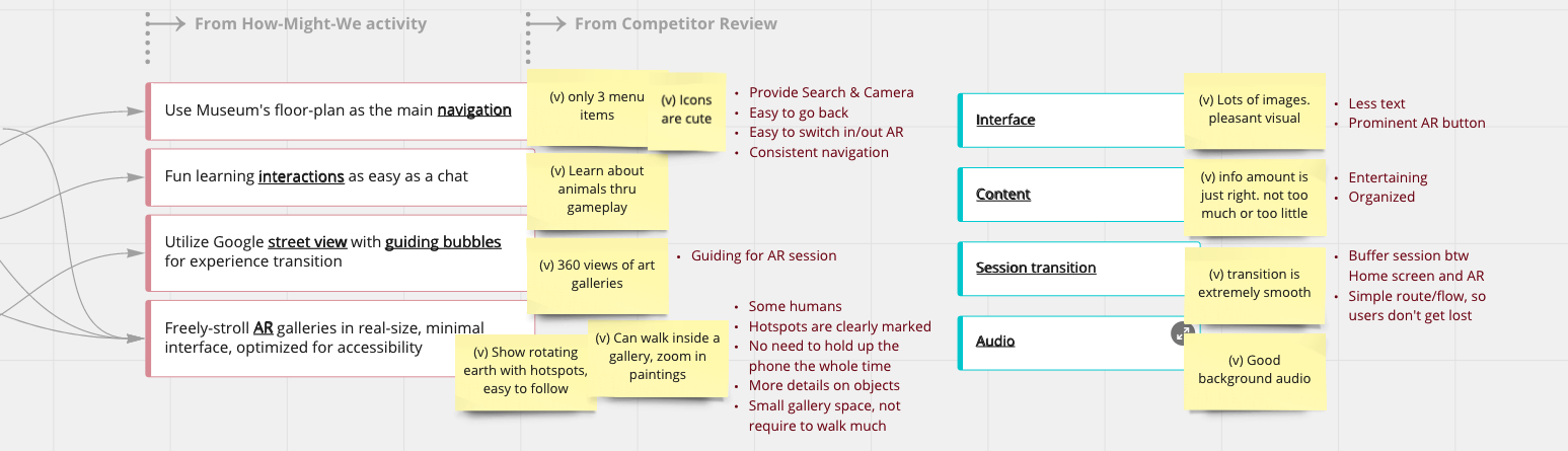
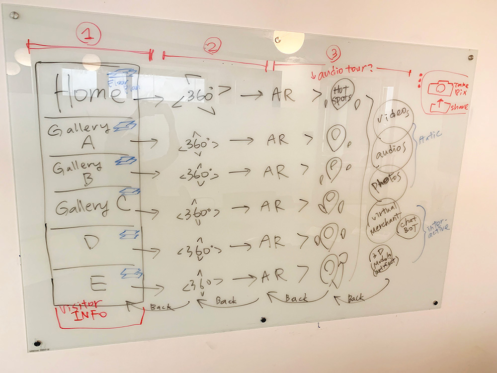
Devising a solution for test
After ideation activities, we designed AR Gallery to test the hypothesis. The structure is layered into 3 parts. Each part brings a visitor to deeper immersion: 1) pretty photos to lead the way; 2) Google street view to scan a gallery; 3) AR session to dig into stories and interact within. It is an at-home museum where people can visit anytime and be entertained.

AR Gallery encompasses crucial elements of entertainment and engagement: learn by play, gamification, and easy to follow. The principle is to apply similar conventions, somewhat novel, so users have a certain level of an established mental model.
A visitor shall feel effortlessly flow in and out. The street view served as a buffering mental prep before her reality extended and a stationed mode for the disabled or those who don’t want to hold up the phone for long. This solution responded to the research discovery and hypothesis of bringing a virtual travel and fun experience before people’s eyes.
Success measures
And then, we were able to devise a success-measure framework based on the envisioned user journey. I dissected it into 3 segments, a) initiation, b) completion and c) satisfaction, with respective goals:
| Goal | Signal | Metric |
|---|---|---|
| a) Entering the AR session | Dropouts | Completion rate, Dropout rate |
| b) Interaction with hotspots occurred | Hot spot visits, Videos and audio plays, Virtual character appearances | Hot spot accuracy or error, Video/audio starting rate or error, Time spent with virtual person or error |
| c) The experience is immersive and fun | Satisfaction, Confusion | Visitor satisfaction, Visitor NPS |
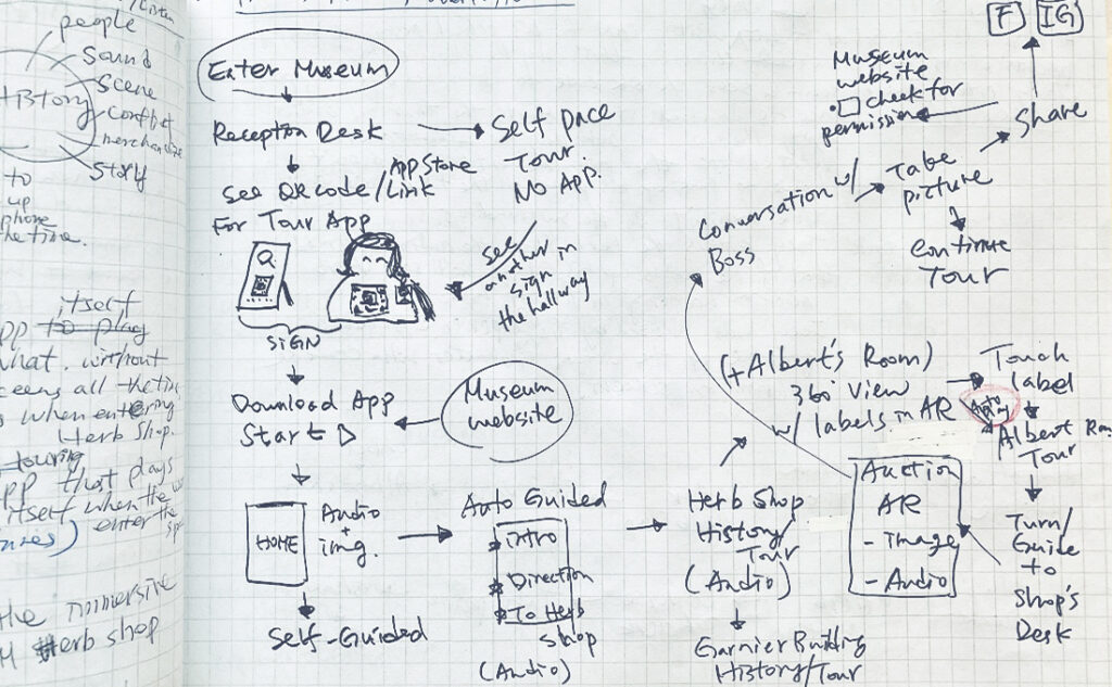
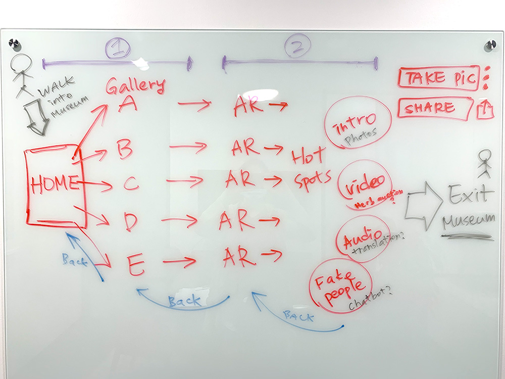
Reworking the user flow
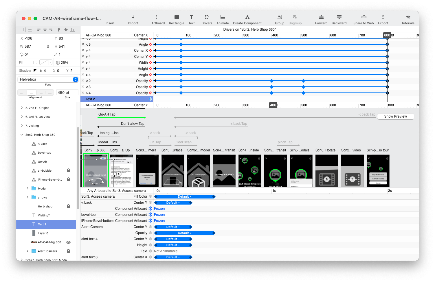
After the project direction diverted, I sketched a different user flow based on the new devised solution. Comments from peers were that it’s not clear enough for creating a prototype. So I drew another one with more certainty. It turned out that the well-thought-out sketch indeed speeding up the followed wireframe design immensely.
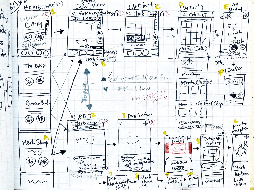
User flow wireframe
I wanted to design for simplicity rather than complexity. So the flow is bound in the idea of easy to use and understand. It comprises simply 3 parts and is optimized to be confusion-free for all ages.
| 1. Museum home ↔ └ Gallery A ─ └ Gallery B ─ └ Gallery C ─ | 2. Street view ↔ └ Gallery intro | 3. AR ↔ └ Artifact info └ Virtual images |
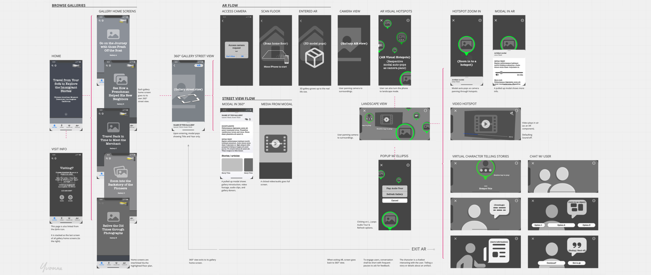
Prototyping
Below is the resulting prototype demonstrated in a hero flow; the intended audience is museum stakeholders and the culturally drawn public.
I hoped to learn if they could smoothly launch the AR to enjoy playing with virtual objects. Therefore, my prototype needs a greater level of fidelity for them to truly grasp the concept. I decided to:
- Create just one complete clickable flow so we can test early;
- Use the Apple UI kit for icons, modals, and color pallets to speed up the process and avoid reinventing the wheel
Hi-Fi prototype
Considering the best approximation of the experience when prototype-test, I chose Principle as a design tool for its powerful animation and video features. My layout, color, and affordance designs went through user feedback and a few changes.
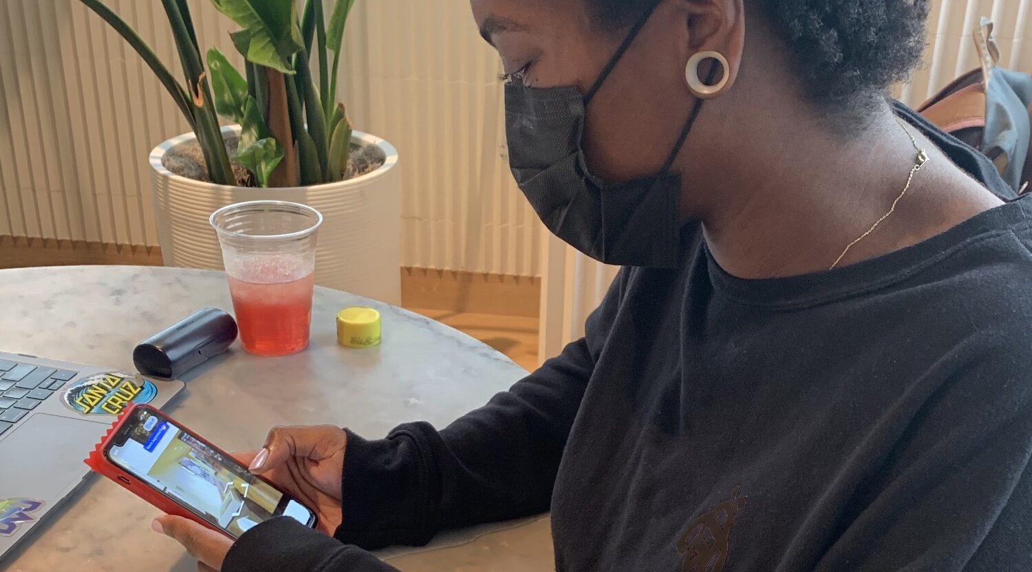
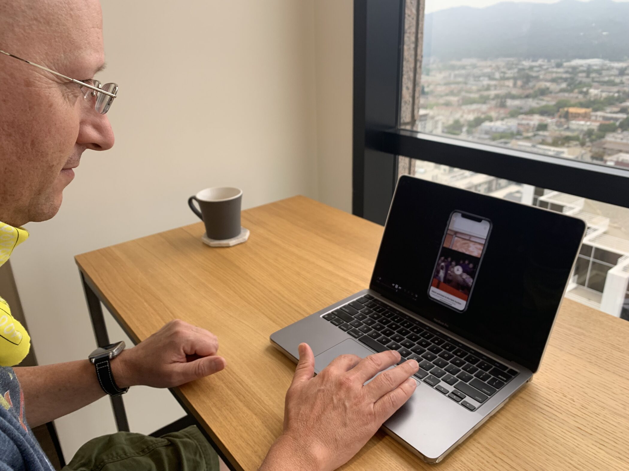
User test
Method
Moderated + in-person in-office testing + observation
Goals
- To learn about how easy or difficult for a user to launch the AR feature
- If succeed, observe a user’s reaction in the AR environment
Situations and Outcomes
- Because not all the buttons and screens are clickable, I sometimes had to explain and guide a little bit.
- Some interruption is needed, so a user can go around the dead links.
- Once entering the gallery front screen, everyone launched AR smoothly.
- Most users find it interesting and funny to bot-chat with the virtual merchant.
Insights and learning
- Background sound/music is critical in the AR session
The test done with an attorney had some problems. He commented that he was expecting to hear some background sound or music in the AR session. Because when we’re in a silent extended reality, it feels ghosty and alone. This echoed one of our parked ideas of “no creepy silence.”
- The updated designs must be inclusive of the disabled users
An Education Manager from the museum went through the prototype. She’s impressed and advised some tests with the disabled people. Although I’m not able to find a handicapped person at that time, her advice is profoundly valuable: who needs to visit a virtual museum more than the disabled?
- There’s a conceptual gap between people who experienced AR before and those who have never had
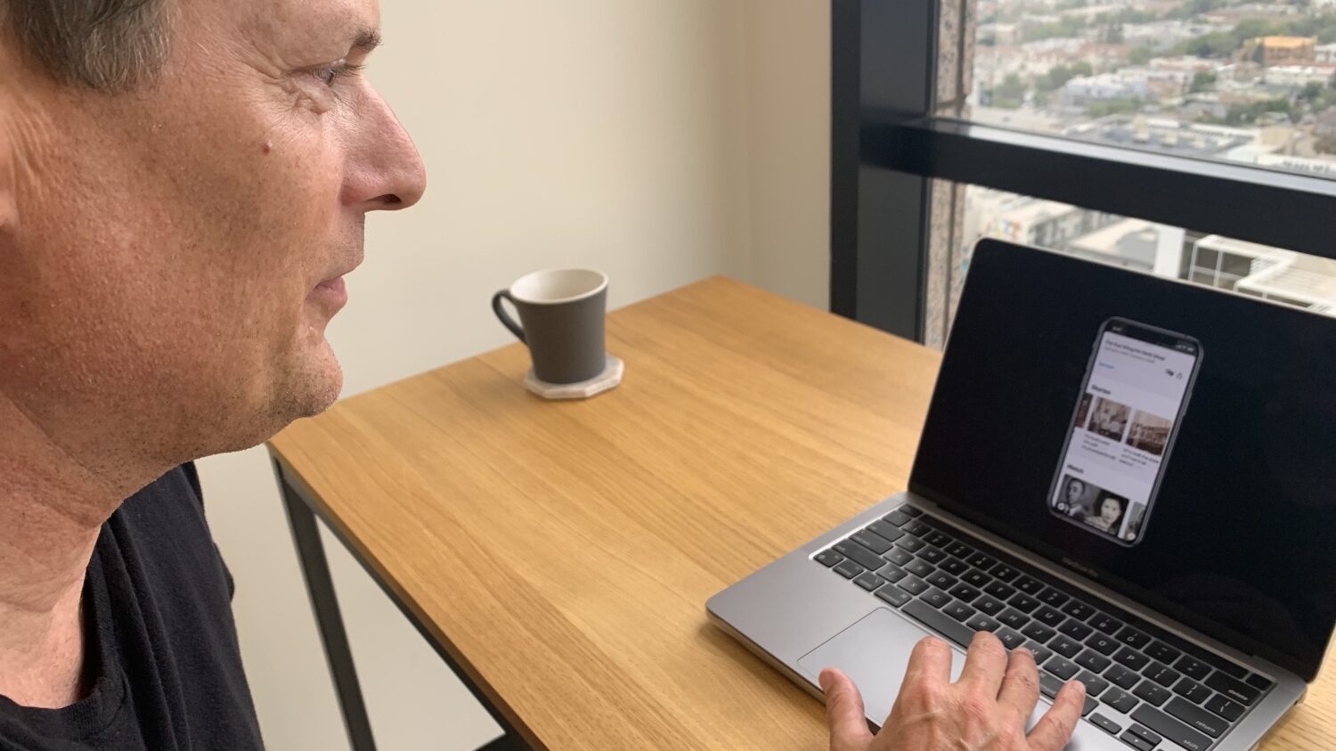
We need to add more guidance on-screen. Participants who don’t know what AR is, don’t understand the idea of seeing virtual objects in their real environment. I invited an office manager to test on an iPhone. I sat next to her to observe her tapping through the screens. She went all the way to the AR session with no need for explanation. I learned that she uses many apps, seeing AR is not news.
Retrospect
The most challenging part of the project was assessing feedback. Which ones to listen to? It was not easy in the beginning to take in test results. But as we did it repeatedly, I learned to spot patterns, make changes, then try again.
What I can do better going forward:
💪 Reaching goals
We’ve reached the goals of creating a functional prototype, although partial, and making it fun, informative, easy to use. We need to make it fully functioned to realize the unsucceeded goal of giving users total control.
💪 Research
At times I thought I know my users. It turned out I don’t. Adopting a beginner’s know-nothing mindset is a must.
💪 User test
Getting feedback early is really helpful to steer this project in the right direction. Although I found my candidates, I can do better with a prepared script, less moderation, and ask opinions on other museum apps.
On the flip side, it’s good that we tested with users who probably wouldn’t use our product and got to hear their side of the story. After all, the product is better to be clearer than not.